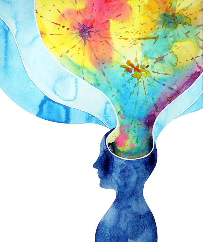
If you have ever put on red and felt that little bit more powerful, popped yellow flowers in a vase to cheer yourself up, or detected a greater sense of serenity when surrounded by greenery, you’ve been directly influenced by colour. Its effect on how you feel is real and experts say colour has the power to improve our mood.
“Colour absolutely sparks joy in humans,” says Karen Haller, London-based colour & design psychology specialist and author of the best-selling The Little Book of Colour.
“Every colour has the potential to change how we feel in an instant because it delivers an emotional experience. Colour is arguably the simplest tool we have at our disposal to enhance positive emotions and increase wellbeing.”
According to Dr. Emily Brayshaw, Research Associate at the Faculty of Design, Architecture and Building at the University of Technology Sydney, colour has been meaningful to humans for as long as we have been dressing.
“The ancient Egyptians loved gold, red, turquoise and blue and associated these shades with royalty,’ says Dr Brayshaw.
“The Romans and later the Byzantine empire privileged Tyrian purple. Extracting this dye involved tens of thousands of murex rock snails and substantial labour, and as a result, the dye was highly valued.”
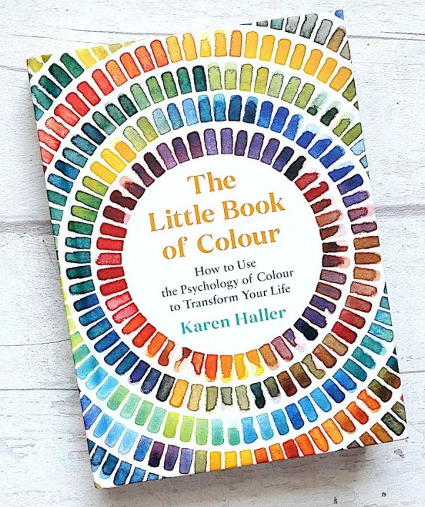
Colour psychologist Karen Haller is the author of The Little Book of Colour. BUY IT HERE.
In 2022, this long-loved hue made a vibrant comeback with Pantone announcing Very Peri, a joyous periwinkle blue with a violet-red undertone, as colour of the year.
According to Dr Brayshaw this was a direct reflection of the post-pandemic party mood. “It’s about being seen and feeling festive,” she says. “People want to brighten up their lives.”
This year, Pantone’s colour forecast is for magenta, a bold carmine-like red, signalling a mood shift towards finding passion.
“Colours that are low in saturation are more emotionally soothing and lead to a calmer or less intense emotional state,” says Karen.
“The more saturated or intense a colour, the more stimulating it can be for your emotions.”
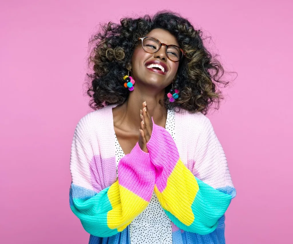
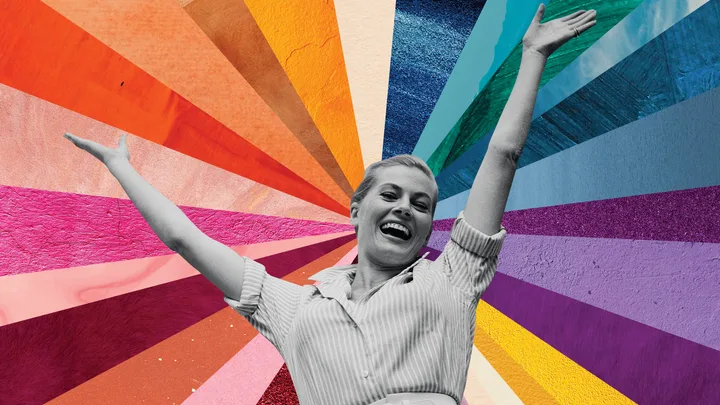
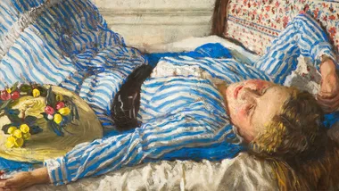
Colourful clothing is not only ‘in’ right now, but wearing bright hues can also improve your mood.
(Credit: Image: Getty)FIND YOUR HUE
While trends will come and go, Karen predicts colour personalisation as a growing cultural movement.
“It’s about picking colours that express your authentic personality, so that you can express the true you from the inside out,” says Karen.
She says surrounding ourselves with colours that resonate with us personally can help us connect with ourselves and others.
“When we feel connected, we feel happier about who we are,” she says. “And when we feel happier about who we are, we can begin to lead happier and more fulfilled lives.”
“Colour absolutely sparks joy in humans”.
(Credit: Image: Getty)THE POWER OF COLOUR
ADD CHEER: Yellow is like a cheery hello! On the greyest of days, it’s like taking the sunshine with you.
POWER PLAY: There’s nothing shy or retiring about red. It commands attention and will always get you noticed.
CONFIDENCE BOOST: Wear darker blues to appear authoritative and knowledgeable yet still approachable, trustworthy and reliable.
QUICK THINKING: Turquoise is a stimulating colour that wakes up your mind.
HARMONIOUS: Darker greens resonate balance and harmony, providing a sense of reassurance and peace.
PLAYFUL SPIRIT: A joyful hue, orange is for great for lightening the mood.
WEIGHTY WHITE
Researchers from Oxford University found people eat less from a red plate (red is, after all, a colour our primal nature may connect with danger). Conversely, eating from a big white plate might wake up your appetite – in some studies, food was perceived as more flavoursome (often sweeter) when served on a white dish.
SLEEPY HUES
“The best palettes for a good night’s sleep are those that are soothing, which means choosing colours that are low saturation,” says Karen. “Think light pink, which is physically soothing, or light blue which is mentally soothing. Soft peaches and apricots, pale greens, and soft purples are also good.” Karen recommends avoiding highly stimulating colours, such as bright red if quality sleep, rather than lots of action, is your top priority.
SERENE GREEN
Experts at the University of Michigan found that surrounding yourself with greenery can boost your mood and reduce cortisol stress levels in as little as twenty minutes.
BLONDE AMBITION
Studies (mostly led by hair colour brands) have consistently found that women who dye their hair blonde feel more confident and sexy. Scientists have theorised that lighter hair may often be associated with youth and good health.
TOUCH POINT
As well as colour, texture can also influence your mood. “Sometimes we want the hard sparkle of metals, jewels and reflective surfaces for confidence, other times soft fabrics such as silk, plush cotton and velvet can offer comfort,” says Dr Brayshaw. “It’s no co-incidence that the Oodie was so popular during the pandemic, it’s like a big hug.”
Related stories
Native ad body.

Native ad body.


Native ad body.